Longform design study No. 01 Design-studio editorial
Tubik Studio
A studio blog that treats restraint as the brand. High-contrast serif display, a light humanist sans, pure black on white, one violet accent, and body copy set at 1.75 leading.
Readable.
01 — AnatomyHow it structures longform content
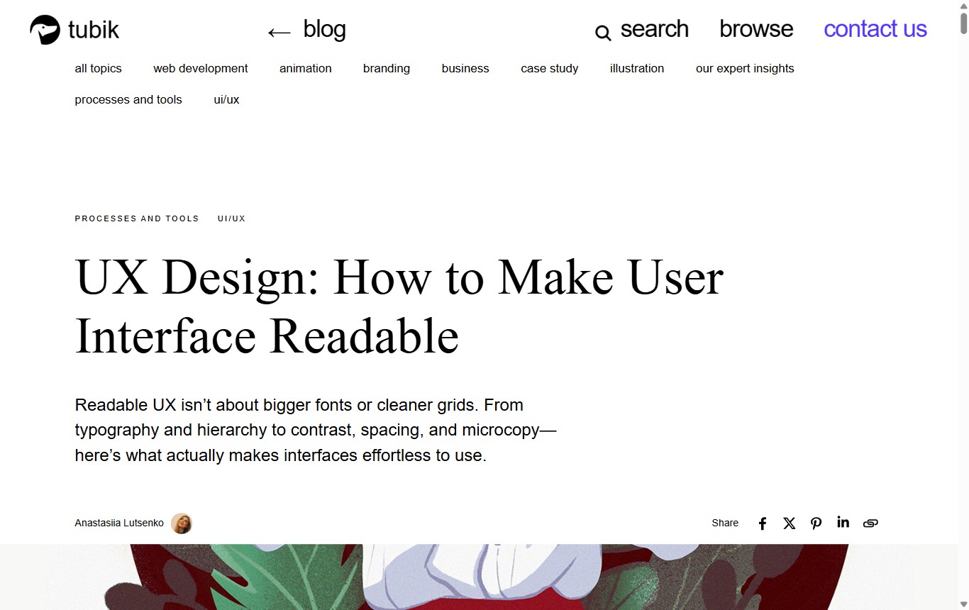
The article opens with almost nothing. A tall band of empty space sits above the headline, so the first thing you register is calm, not content. That pause is deliberate: it resets the eye before a long read and signals that the page is unhurried.
The reading order is strict and repeatable. A small-caps kicker names the topic, then a large serif headline, then a plain-sans deck of two or three lines, then a quiet byline row with an author and share controls. Only after that does the first image appear, contained inside the column rather than bleeding to the edges.
Hierarchy without noise
Every level of the page is separated by type and space, never by boxes, colour blocks, or rules. The serif headline is set at 72px against 20px sans body, so the size jump alone tells you what is a heading. Section headings drop to 38px in the same serif, still unmistakably above the body. There is one accent colour, a violet near #5B4EE9, and it is rationed: links, the logo mark, and the occasional detail. Nothing competes with the words.
Imagery stays contained
Across roughly eighteen images, none are full-bleed. Each one sits inside the same measure as the text, framed by generous margins above and below. That keeps a single, steady rhythm as you scroll: text, breath, image, breath, text. The photography carries mood, but it never hijacks the layout or breaks the column.
Whitespace does the pacing
The document runs close to 23,800 pixels tall, yet it never feels dense, because space is used as punctuation. Wide margins around headings, air above every image, and a body leading of 1.75 give each idea room to land. On a piece about making interfaces readable, the layout is the argument.
02 — AdaptationDesktop vs mobile
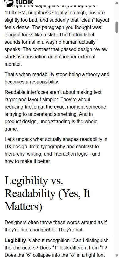
The phone layout is not a shrunk desktop. Two things change together: the body size steps down from 20px to 16px, and the leading relaxes from 1.75 to 1.5, because tight columns need less air than wide ones. The serif headline drops from 72px to 38px but keeps its weight and contrast, so the voice survives the resize.
| Property | Desktop · 1366 | Mobile · 390 |
|---|---|---|
| Body size / leading | 20px / 35px (1.75) | 16px / 24px (1.5) |
| Headline (H1) | 72px, serif 400 | 38px, serif 400 |
| Section head (H2) | 38px, serif 500 | ~28px, serif 500 |
| Column measure | 900px | 345px |
| Characters / line | ~90 CPL | ~43 CPL |
| Columns | Single, left-aligned | Single, ~15px gutters |
| Imagery | 18 contained, 0 bleed | Full-width in column |
One honest note on the reference: at 900px the desktop measure runs to about 90 characters per line, wider than the 45–75 usually recommended. It stays readable only because the 1.75 leading is so generous. This homage keeps the leading and the voice but tightens the column to roughly 720px (near 66 characters), which is easier on the eye without changing the character of the page.
03 — SystemThe design system
Stripped to tokens, the whole look is a serif-plus-sans pairing, a near-monochrome palette, one accent, and a lot of leading. Here is the specification this page is built from.
Type pairing & scale
Palette
- Ink
#0A0A0A - Paper
#FFFFFF - Muted
#6B6B6B - Hairline
#E7E7E7 - Accent violet
#5B4EE9
Measure, leading & devices
04 — TakeawaysWhat to steal
-
Buy attention with empty space
A tall pause above the headline costs nothing and makes the first line feel considered. Silence before the first word is a design decision.
-
Let size carry hierarchy
A 72px serif over 20px sans needs no rules, boxes, or colour to signal rank. Pick two type roles and make the jump between them large.
-
Ration the accent
One violet, used only on links and marks, reads as intent. The discipline is spending it rarely so it still means something.
-
Pair high leading with a sane measure
1.75 leading rescues a wide column, but do both: keep the air and pull the line length toward 66 characters so nothing depends on luck.
-
Keep images in the column
Contained figures with margins hold a steady scroll rhythm. Full-bleed is a tool for drama, not for a calm, text-first read.
05 — ReferenceVisual reference