Longform design study / No. 04
Nielsen Norman Group
How a UX-research publication earns trust the boring way: a serif body, a bold sans headline, ultra-loose leading, and a card rail that guides without ever raising its voice.
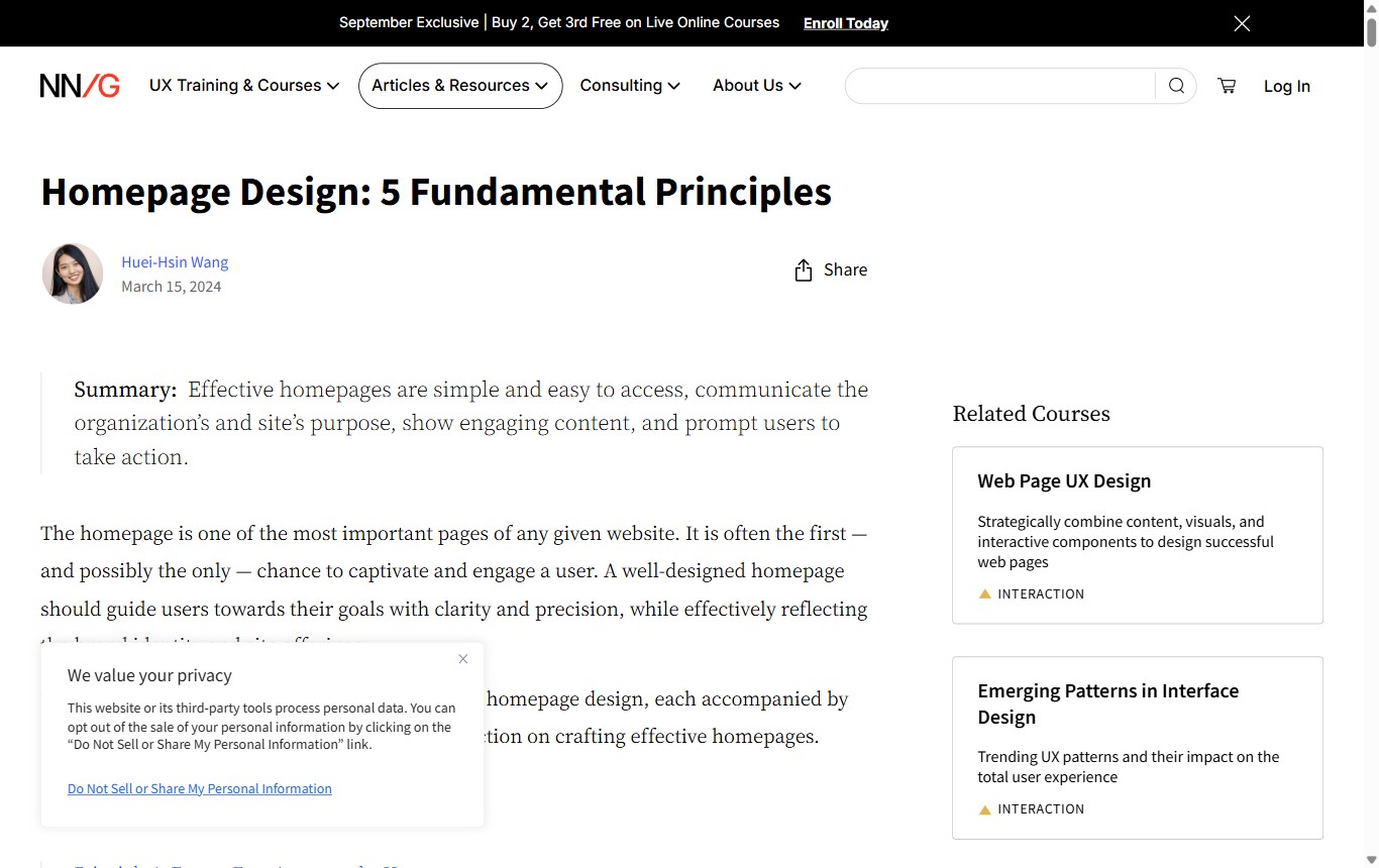
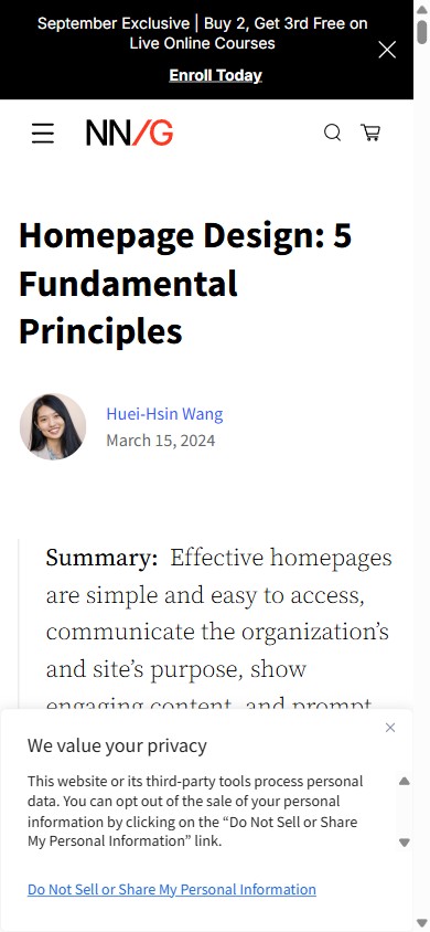
Summary: NN/g reads like a journal, not a blog. It sets long-form body copy in Source Serif at 20px with 1.85 line-height, pairs it with a bold Source Sans headline, and parks contextual course cards in a fixed right rail. The authority is almost entirely typographic. Nothing shouts, and that is the point.
The article that inspired this study is a plain-looking page about homepage design. It uses no hero photo, no gradient, no animation. Yet it feels credible the moment it loads. That credibility is manufactured with a small, disciplined set of typographic decisions, and it is worth pulling those decisions apart because they transfer to almost any reference or documentation site.
This page is a homage. It is built in NN/g's own visual language so the analysis and the object of analysis look like the same thing. Everything below is measured from the live article and rebuilt from a spec.
How it structures longform content
The page has a single, predictable spine. There is no clever scroll, no reveal, no reordering between breakpoints. A reader who has seen one NN/g article knows exactly where the next one keeps its parts, and that familiarity is itself a usability feature.
The reading order
From the top edge down, the layout is completely conventional. A slim black promo bar, the masthead, the headline, the byline, an abstract, the body, and a rail of related links. Convention is deliberate: the reader spends zero attention learning the page and all of it reading the argument.
Hierarchy without noise
The hierarchy is built from contrast of typeface, not size explosions. One bold sans headline sits at the top. The section heads below it are set in the serif at a modest 22px with semibold weight, so they read as pauses in the prose rather than billboards. The single loudest structural device is the summary block, and even that is just a three-pixel rule and a bold label.
Colour is rationed. Black does the structural work, blue marks links, and a single red-orange is reserved for the brand mark and the small triangles on category chips. Because the accent appears so rarely, it carries weight when it does.
Imagery does a job
The source article carries roughly thirty figures, and not one is decorative. Each is a screenshot or diagram that earns its place by showing the thing under discussion, sized to sit inside the text measure and captioned in the sans face. Nothing bleeds to the edge, nothing floats, nothing autoplays. Imagery is evidence.
Effective homepages are simple and easy to access, communicate the site's purpose, show engaging content, and prompt users to act.
Effective homepages are simple and easy to access, communicate the site's purpose, show engaging content, and prompt users to act.
Desktop vs mobile
The most interesting responsive decision is a refusal. On a 390px phone, the body type does not shrink. It holds at 20px with the same 1.85 leading it uses on a wide desktop. The measure narrows and the rail drops below the article, but the reading experience of the prose itself is held constant. That is a deliberate bet that legibility matters more than fitting more words on screen.
| Attribute | Desktop | Mobile (390) |
|---|---|---|
| Body type | Source Serif, 20px / 37px (1.85), black | Holds 20px / 37px |
| Measure | 835px column, ~84 characters per line | 343px, ~34 characters per line |
| Headline | Source Sans 700, 40px | Source Sans 700, 34px |
| Section heads | Serif 22px, semibold | Serif 22px, semibold |
| Layout | Two columns: 835px article + ~300px card rail | Single column; rail collapses below the article |
| Links | #385AFF, no underline until hover | Same |
| Document height | ~25,000px end to end — a genuinely long read | |
Notice what does not change across the two columns above: the type face, the leading, the link colour, the section-head treatment. The layout adapts; the reading contract does not.
The design system
Two families do all the work. A serif for the body, because a serif at generous leading reads as something to sit with, and a bold sans for headings and interface, because it cuts cleanly at any size. The pairing is the whole personality.
Type pairing and scale
- BodySource Serif 4 — 20px / 1.85, weight 400, optical sizing on
- Headline (H1)Source Sans 3 — 40px, weight 700, tight tracking
- Section head (H2)Source Serif 4 — 22px, weight 600
- Summary leadSource Serif 4 — ~1.28rem, bold "Summary:" label, 3px left rule
- Category chipSource Sans 3 — 0.7rem, 700, uppercase, .08em tracking, red-orange ▲
Palette
Measure, leading and signature devices
- Measure835px column → ~84 CPL, at the generous end of the readable range
- Leading1.85 — unusually loose, held on mobile
- Summary block3px left rule + bold label, an abstract before the prose
- Category chipred-orange ▲ + uppercase sans label, colour never the only signal
- Bylinecircular avatar + blue name link + gray date + right-aligned share
- Card rail~300px right column of related-reading cards, sticky, stacks on mobile
What to steal
- Set long reads in a serif. A body serif signals "sit down and read this," which is exactly the posture a reference or documentation site wants from its audience.
- Loosen the leading well past your instinct. 1.85 looks like too much in a design tool and reads beautifully in a browser over thousands of words. Generous line-height is what buys you a comfortable 20px.
- Hold your type size on mobile. The reflex is to drop to 16px on a phone. NN/g keeps 20px and lets the measure do the adapting. Legibility beats density on a text page.
- Give the reader an abstract. A one-sentence summary behind a left rule respects the reader's time and sets expectations before the scroll.
- Use accent colour like seasoning. One red-orange for brand and chips, one blue for links, black for everything else. Rarity is what makes an accent read as intentional.