Longform design study · No. 05
Shorthand
A study of the immersive scrollytelling feature that turns an article into a cinematic journey: full-screen colour scenes, a light serif in deep green, and a narrow sans column that keeps the reading calm.
How it structures longform content
The page is not a document you scroll. It is a sequence of rooms you walk through, one screen at a time.
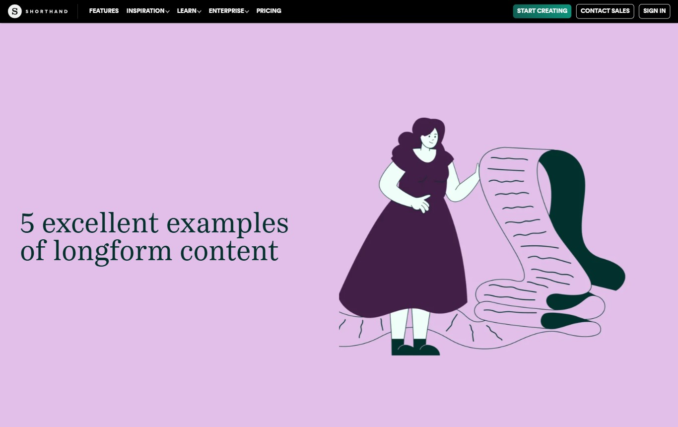
Each scene fills the viewport and owns a single idea. A title lands on a colour field, the next scene drops you into a quiet reading column, then a full-bleed field resets the eye before the next block of prose. Pacing carries the story; the reader never sees two competing things at once.
The reading order
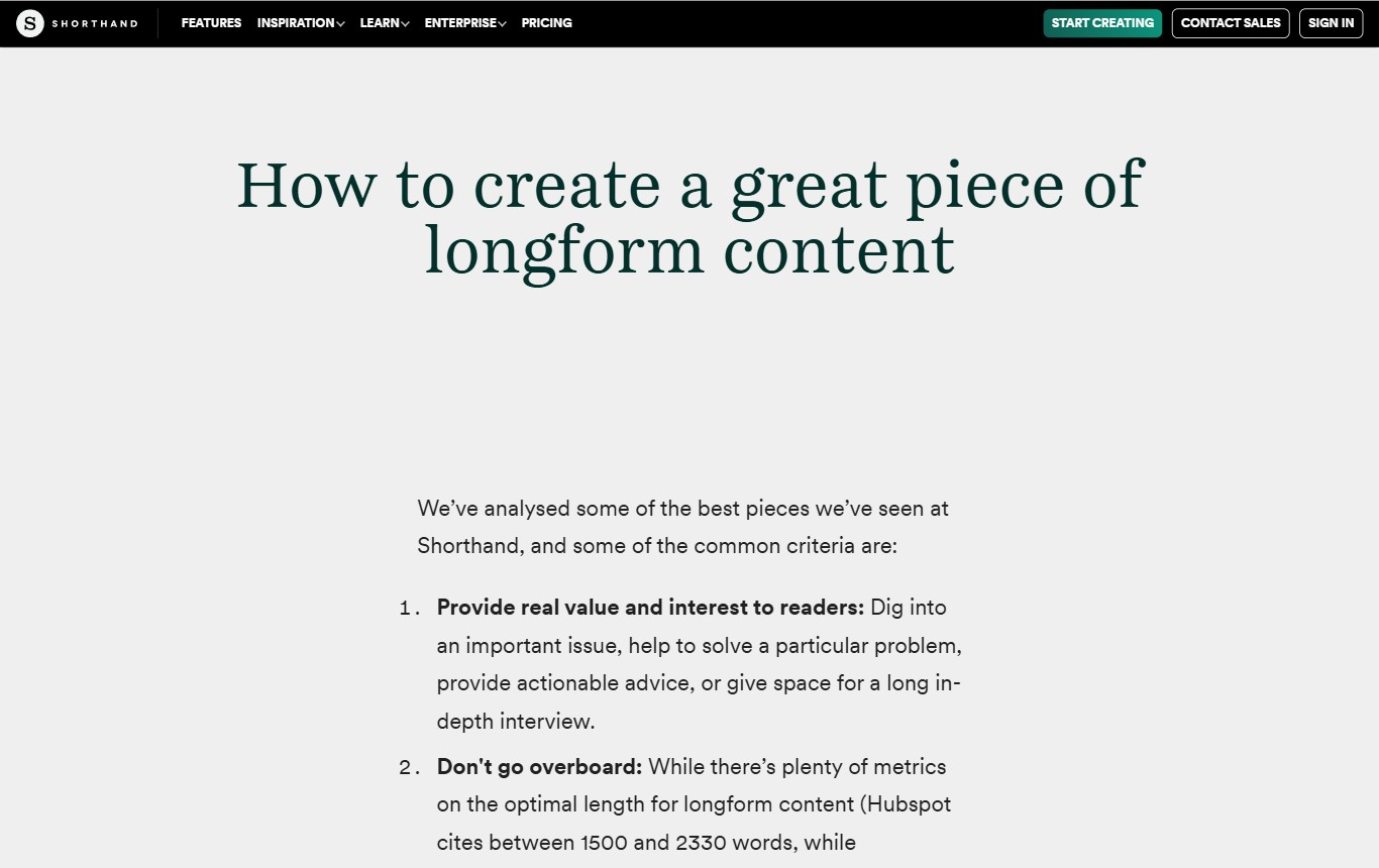
Hierarchy is set by scale and space, not by rules or boxes. The display serif is huge and centred so a section title reads as a chapter break. Body copy sits in a narrow column near the middle of the screen, so the measure stays short even on a wide monitor.
Hierarchy devices
Three devices do most of the work. Colour fields signal a change of gear. A centred light serif marks the start of a section. And numbered lists with bold lead-in phrases turn advice into something scannable without breaking the calm voice.
Imagery strategy
Media is full-bleed and edge to edge. Text either sits beside it or rides on top over a dark scrim, so the picture is the room and the words are the caption. Nothing floats in a sidebar.
The signature
A cinematic scroll journey where each full-screen colour scene is a beat, and the story is the sequence.
Deep green and an emerald accent hold the brand together across every field. The measure never widens. The serif never shouts. The colour does the pacing.
Desktop vs mobile
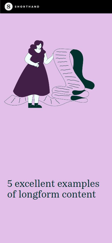
The layout keeps its rhythm on a phone. Scenes go full-width, the serif scales down but stays centred, and the reading measure tightens rather than reflowing into something new.
| Property | Desktop | Mobile · 390px |
|---|---|---|
| Scenes | 7 full-viewport scenes, ~30,500px document | Same scenes, stacked full-width |
| Display face | PassengerSerif 300 (Fraunces 300 here) | Same face, sizes scale down |
| Hero title | 56px, deep green #03302B | ~34px, stays centred |
| Section title | 65px centred | Scales fluidly, centred |
| Body face | CircularWeb (Manrope here) | Same face |
| Body size / leading | 20px / 1.5 | ~19px / 32 (1.68) |
| Measure | Narrow ~640px centred column | Near full-width with side gutters |
| Fields | 10 full-bleed colour / media fields | Fields become full-width bands |
| Nav | Dark bar, emerald pill CTA | Condensed dark bar, logo + CTA |
The design system
Palette
What to steal
- Let colour do the pacing. Give each section its own full-screen field and change the field to signal a change of idea. The reader feels the structure before they read a word.
- Keep the measure narrow on a wide screen. Anchor body copy in a ~640px column no matter how big the monitor is. Short lines read faster and feel more considered.
- Pair a light serif with a geometric sans. A 300-weight display serif, centred, reads as editorial and calm; a plain sans keeps the body neutral so the serif can carry the personality.
- Use one accent, everywhere. A single emerald against deep green ties the nav, the CTA and the links together without a second decision.
- Make lists do the heavy lifting. Numbered items with bold lead-in phrases turn dense advice into something skimmable without shouting.
Visual reference
Desktop · hero & a reading scene
Mobile · 390px