Longform Design Study · No. 06
Lit in Colour
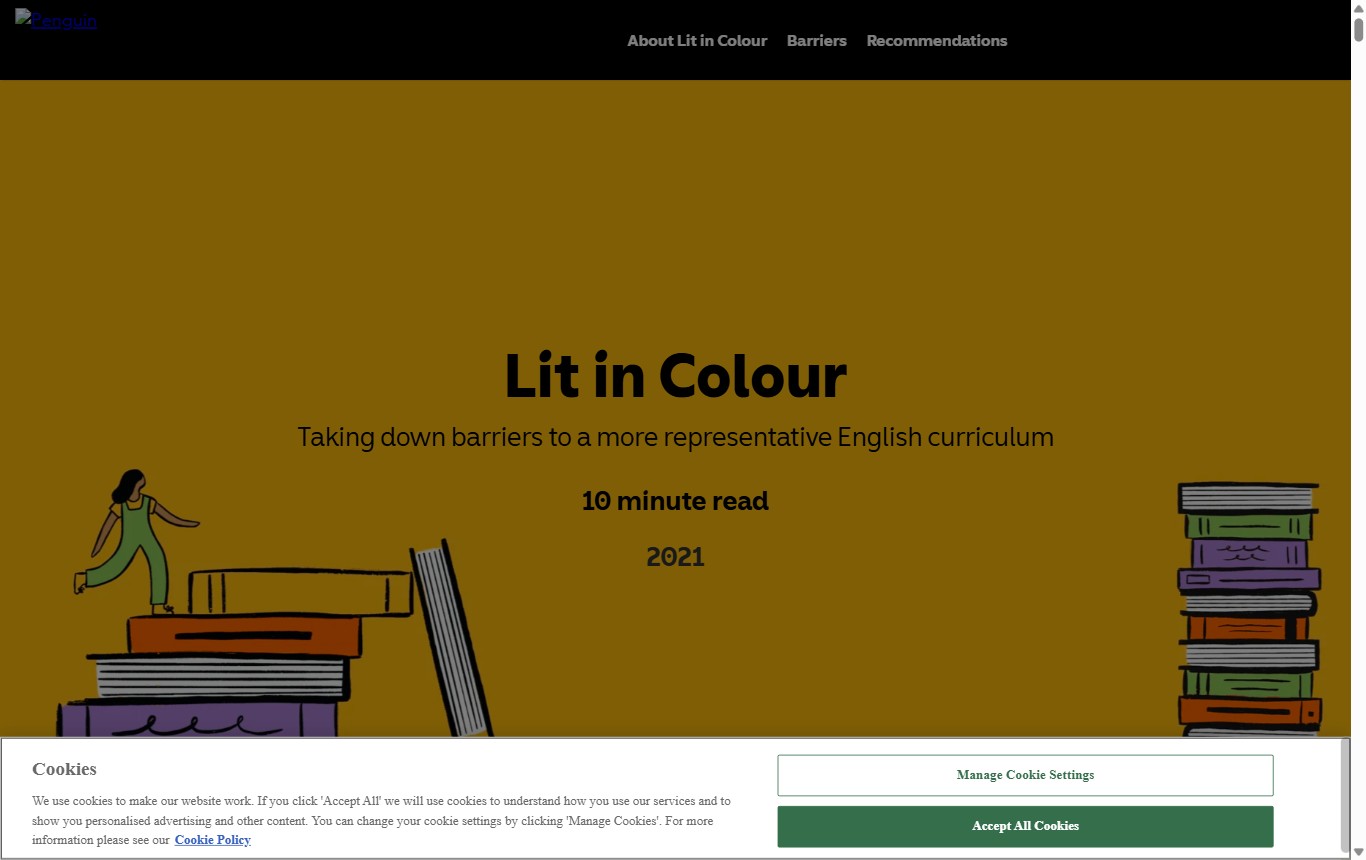
A publisher microsite that carries its mission in bold display type and saturated colour, then keeps the words quiet.
How it structures longform content
The page reads as a stack of scenes. Instead of one continuous column on a white ground, each idea gets its own full-width block in a different saturated colour. You scroll from mustard, to aubergine, to green, to orange, and the change of ground tells you a new beat has started. Colour does the work that a horizontal rule or a big number would do elsewhere.
One centred column, start to finish
Everything sits on the centre line. The title, the deck, the reading time, the body copy and the illustrations all share a single narrow measure of about 540 pixels. Nothing breaks left or runs to a sidebar. That symmetry is what makes a long page feel calm even when the colours are loud.
Display type carries the emotion
Headings are set large in a bold geometric sans and given room to breathe. The body underneath is a light, low-contrast sans that never competes. The split is deliberate: the display face is the voice of the campaign, the body is just there to be read. You feel the mission in the headline and take in the argument in the paragraph.
Illustration instead of photography
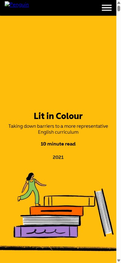
The imagery is flat, hand-drawn and playful — figures climbing stacks of books, tidy piles of spines in the palette colours. It bleeds to the edges of a block rather than sitting in a framed slot. Because it is drawn, not photographed, it stays on-brand across every colour scene and never fights the type for attention.
Desktop vs mobile
The layout does not redesign itself for small screens. The colour blocks are already full-width and the column is already centred, so the mobile view is mostly the same page at a smaller scale. Type steps down, the measure narrows, and the two hero illustrations restack into one centred column.
| Property | Desktop | Mobile (390px) |
|---|---|---|
| H1 display | 61px / 700 | 28px / 700 |
| H2 on blocks | 35px, white | ~24px, white |
| Body size | 18px | 16px |
| Body leading | 30.6px (1.7) | 27px (1.68) |
| Measure | 540px | 306px |
| Characters / line | ~60 CPL | ~38 CPL |
| Blocks | Full-width, centred | Full-width, centred |
| Hero art | Flanks the title | Stacks below |
The leading ratio stays close to 1.7 on both. That consistent, generous line height is a big part of why the light body weight stays legible on strong colour.
The design system
A small, tight kit: two type families, six colours, one measure, one centring rule. The whole personality comes from how boldly those few pieces are used.
Type pairing & scale
Display is a bold geometric sans (the site uses Penguin Inclusive Sans Display; this homage stands in with Poppins 700). Body is a humanist sans set light (the site uses Avenir; here, Nunito Sans 300). Scale runs 61 / 35 / 18 on desktop, all centred.
Palette
Tokens
- Measure~540px, one centred column
- Leading1.7 body / 1.1 display
- Signature devicesColour-blocked scenes · centred axis · hand-drawn book art · slim black nav
What to steal
-
Let colour be the section break
Swap tired dividers and drop caps for full-width colour blocks. A new ground reads as a new chapter with zero extra chrome.
-
Split the labour of your type
Loud display face for feeling, quiet light body for reading. When one voice shouts, the other should whisper.
-
Commit to a single centre line
Centring the whole column keeps a loud, colourful page feeling composed and intentional rather than busy.
-
Draw, don't photograph
Flat illustration in your palette travels across every colour scene and never clashes the way stock photos do.
-
Keep leading generous on colour
Light body weight survives on saturated grounds only if the line height is loose. Hold near 1.7 and it stays readable.
Visual reference