Longform design study No. 08
Honda Engine Room / Bikes · heritage photo-essay
The Café Racer Revolution
A dark, cinematic brand photo-essay where scale and photography carry the emotion. Type stays loud but sparse: giant condensed white display over full-bleed fields, brand-red uppercase pull-quotes, and a tight white reading column.
Scroll to read the teardown
How it structures longform content
Photography sets the pace, type punctuates it
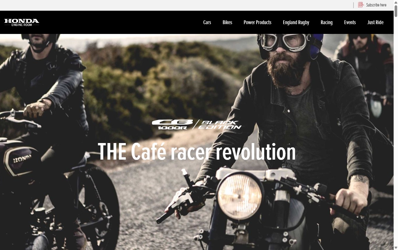
The page reads like a film. It opens on a full-bleed hero with a single condensed headline over a scrim, then drops you into a narrow white column of body text. That contrast — wall-to-wall image, then a quiet ribbon of prose — is the whole rhythm. You are never asked to read for long before the next photographic field takes over.
The reading order is strict and linear. There is no sidebar, no related-links rail, no card grid. Scroll is the only interaction, and the document runs long: roughly 17,900px of vertical travel on desktop, carried by 107 images, fourteen of them full-bleed. The measure stays tight at about 540px (~68 characters per line) so the prose never competes with the imagery for attention.
Hierarchy devices
Three signals do almost all the work. A small red uppercase eyebrow in the display face marks a new movement. The giant Oswald-style condensed headline anchors the top of each major beat. And a red, uppercase pull-quote breaks the column to reset your eye between passages.
Photography plus scale equals emotion; the type is loud but sparse. The governing idea behind every band on the page.
Imagery strategy
Images are treated as environments, not illustrations. They bleed edge to edge, sit under heavy vignettes, and often carry a product lockup set in italic condensed type. Captions are small and set in the display face, tagged in red. The effect is that each photo becomes a room you walk through before the next stretch of text.
Signature techniques
Near-black canvas throughout. One typographic voice for everything structural (a condensed grotesque) and one quiet sans for the body. Colour is rationed: red appears only on eyebrows, quotes, and interactive accents, so it always reads as emphasis rather than decoration.
Full-bleed field · evoked, not hotlinked
A stand-in for the site's cinematic hero photography. The real page carries a warm, grainy desert scene; here it is rebuilt from the spec palette so no copyrighted image is embedded.
Desktop vs mobile
Same voice, retuned for the thumb
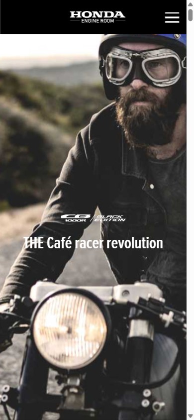
The layout does not restructure on small screens — it compresses. The column widens to the full viewport, the display type drops hard, and body leading tightens. Photography stays full-bleed and becomes the dominant surface, so the phone reads even more like a scroll-through film reel than the desktop does.
| Measure | Desktop | Mobile (390px) |
|---|---|---|
| H1 display | 84.8px / weight 400 | 35px |
| Body text | 16px / 27.2 (1.7) | 14px / 23.8 (1.7) |
| Pull-quote | 28.8px UPPERCASE red | scales down, stays red |
| Measure | 540px · ~68 CPL | 325px · ~46 CPL |
| Photography | 14 full-bleed of 107 images | full-bleed, edge to edge |
| Navigation | black bar + red accents | collapsed, logo centred |
| Document height | ~17,900px | taller, single column |
Leading holds at 1.7 across breakpoints — the ratio is the constant, the pixel sizes flex.
Caption band · red tag, display face
On the live site, captions sit low-left over the vignette in the condensed face with a red kicker. The dark gradient guarantees text contrast without a solid bar.
The design system
A two-font, one-accent kit
Everything on the page comes from a small, disciplined set of tokens: two typefaces, a near-black canvas, one loud accent, and a tight measure. Below is the spec, rebuilt with web equivalents — Oswald standing in for Proxima Nova Extra Condensed on the display, Inter on the body.
Type pairing & scale
Display — Oswald 500 (for Proxima Nova Ex Cn 400)
Pull-quote — Oswald 500, uppercase
Body — Inter 400
Sixteen pixels on a 1.7 rhythm, held to a 540px measure so the reading column never fights the photography for the eye. Quiet, neutral, and deliberately unshowy.
Palette
Measure & leading
540px reading column, ~68 CPL on desktop; ~46 CPL at 390px.
Body 16 / 27.2 (1.7) desktop, 14 / 23.8 mobile. The 1.7 ratio is fixed.
Signature devices
Full-bleed vignetted image fields; italic-condensed product lockups; red uppercase pull-quotes; small red display eyebrows.
Grain overlay and heavy vignette give flat gradients a filmic, photographic weight.
What to steal
Five moves worth borrowing
-
Ration the accent colour
One red, used only for eyebrows, pull-quotes, and links. Because it never decorates, it always reads as emphasis.
-
Let photography set the tempo
Alternate wall-to-wall image fields with a narrow reading column. The contrast is the rhythm — no card grid required.
-
One loud voice, one quiet voice
A condensed grotesque for every structural moment, a neutral sans for the prose. Two fonts carry the whole page.
-
Keep the ratio, flex the size
Hold leading at 1.7 across breakpoints and let only the pixel sizes shrink. The reading feel stays identical on the phone.
-
Earn contrast with a scrim, not a box
A vignette plus gradient over dark imagery clears the 4.5:1 bar without a solid caption bar breaking the cinematic field.
Visual reference
The source, side by side
Screenshots of the live page, used here only for commentary. All colour-fields above are rebuilt from the spec — no site photography is embedded in the layout.