Longform design study · No. 10
The Pudding — a longform design study, number ten
July 2026
A design study of The Pudding's data-essay format — where a visual lands on almost every screen and the prose plays annotation to the charts.
How it works
How it structures longform content
The Pudding builds a story out of pictures. Prose sets up a question, a chart answers it, and the next chart pushes the argument forward — so the page reads as a run of visual beats rather than a wall of text.
The reading field
Everything sits on a calm pale blue-grey field, not white. The tint takes the glare off a long read, warms the page, and gives every chart the same quiet stage to stand on. Body copy is held in a narrow column around 640 pixels wide, which keeps the measure near 75 characters a line no matter how large the monitor gets.
Hierarchy, kept quiet
The type never shouts. A high-contrast display serif marks the title, small sans labels tag the data, and a transitional serif carries the body. The loudest thing on any screen is deliberately not a headline — it is the chart. Structure comes from the rhythm of visuals, not from a ladder of headings.
Imagery is the spine
On the pockets essay there are roughly 110 significant visuals — about a hundred of them hand-built, interactive SVG charts — against just 30 paragraphs. There is more picture than prose. The words are the connective tissue between the things you are meant to look at.
The signature
A data essay that draws more than it writes — the chart is the paragraph, and the prose is the caption.
The measurements
Desktop vs mobile
The system barely changes shape on a phone. The body shrinks a single step, the column goes full-width, and the charts reflow to one column while staying interactive. The rhythm survives the resize.
| Property | Desktop | Mobile · 390 |
|---|---|---|
| Reading field | Pale blue-grey #E7EEF8 (not white) | Same tinted field |
| Body face | Publico Text serif (Source Serif 4 here) | Same face |
| Body size / leading | 17px / 28.9 (1.7) | 16px / 27.2 (1.7) |
| Measure / CPL | 640px column, ~75 CPL | 375px full-width, ~47 CPL |
| Display face | Canela contrast serif (Fraunces here) | Same, scales down |
| Labels / UI | Atlas Grotesk sans (Inter here) | Same |
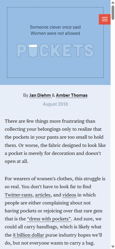
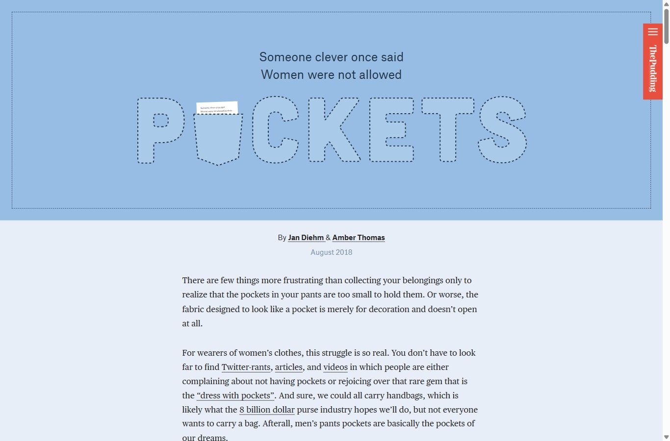
| Hero | Dashed sewing-pattern title on a mid-blue field | Same motif, tighter frame |
| Charts | Full-width interactive SVG, ~1 per screen | Single-column, still interactive |
| Brand | Red vertical "ThePudding" tab + menu | Same tab, top-right |
| Length | ~12.2 screens tall | Longer scroll, same beats |
The point of the study
Visual cadence
This is the move worth stealing. The Pudding paces the essay with images, not headings. A visual appears about every screen, and because each chart is built in SVG it animates, snaps and resizes as you scroll — so the diagram does the work a paragraph would do elsewhere.
Figure 1 · Visuals vs paragraphs, four viz-led essays
Significant visuals plotted against paragraph count. The Pudding is the only one where the blue bar clears the pale bar — where the page draws more than it writes.
Spread across roughly 12.2 screens, that budget works out to a visual about every half-screen. The prose never has to describe the trend in words — the reader simply watches it move. Cadence, not headings, is what tells you where you are in the argument.
Figure 2 · The cadence of visual beats
Each dash is one visual, set along the scroll. The denser the rail, the faster the beat — and a picture is never more than half a screen away.
The parts list
The design system
- Type pairing
- Display: Fraunces, standing in for Canela — a high-contrast serif for the title. Body: Source Serif 4 for Publico Text. Labels & UI: Inter for Atlas Grotesk.
- Type scale
- Body 17px on desktop, 16px on mobile. Section titles clamp up to ~2.6rem in the display serif. Labels sit at ~0.72rem, letter-spaced, uppercase.
- Measure & leading
- Reading column ~640px, about 75 characters per line, line-height 1.7. On mobile the column goes full-width at ~47 CPL, leading held at 1.7.
- Signature devices
- A tinted reading field, a dashed sewing-pattern hero tied to the subject, a red vertical brand tab, and a chart on almost every screen.
Palette
Takeaways
What to steal
- Put the data first. Lead a section with the chart and let the prose annotate it. When the claim is quantitative, the figure is more persuasive than the sentence describing it.
- Tint the field. A pale blue-grey stage beats white for a long, chart-heavy read. It cuts glare and gives every visual a consistent, calm background.
- Pace with pictures. Aim for a visual roughly every screen. That cadence, not a ladder of headings, is what carries the reader through a long argument.
- Keep the measure tight. Hold body copy near 640px and ~75 characters a line even when the charts run full-width. The reading column stays comfortable; the visuals get the room.
- Theme the furniture. A subject-grounded motif — here, dashed sewing-pattern outlines — ties the chrome to the story and makes the piece feel authored, not templated.
Source
Visual reference
Desktop · the dashed-outline hero
Mobile · 390