Longform design study · No. 11
Wait But Why
A study of the long explainer that trades polish for charm — plain sans prose in a wide, forgiving column, blue bold titles, and crude hand-drawn diagrams that do the actual explaining.
How it structures longform content
One column, top to bottom, no chrome in the way.
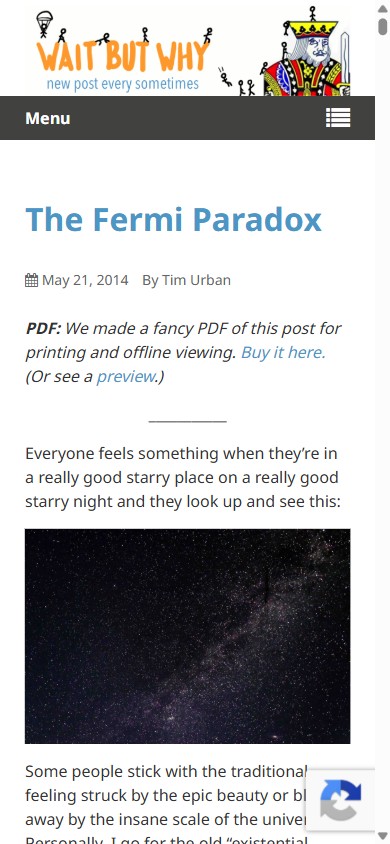
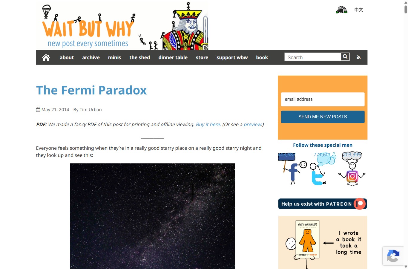
The page is deliberately ordinary in shape: a single reading column on a white background, a blog date and byline, then paragraph after paragraph of plain sans. There is no hero photo, no card grid, no sticky reading progress bar. The structure is a scroll, and the scroll is the whole interface.
What makes it work is that the prose is written to be spoken aloud, and the page is engineered to keep a casual reader moving through a very long argument. Instead of tightening the measure to look literary, it does the opposite — the column runs wide and the tone runs loose, so the page feels like a friend over-explaining something on a napkin rather than an essay you must sit up for.
Three devices carry the reader
- Blue bold titles mark each movement of the argument, so a reader can feel the beats even while skimming.
- Short, frequent paragraphs keep the eye falling downward — few blocks run more than four or five lines.
- Hand-drawn diagrams interrupt the prose exactly when an idea gets abstract, turning a paragraph you might skip into a picture you can’t.
Desktop vs mobile
Same voice, same 16px — the column just narrows.
The layout barely restructures between breakpoints. The body size and leading are held constant; what changes is the measure and the surrounding furniture. On a phone the orange aside drops below the article and the nav collapses to a menu, but the reading experience is identical prose at an identical size — just a shorter line.
| Property | Desktop | Mobile · 390px |
|---|---|---|
| Body face | Noto Sans (Inter here) | Same face, same size |
| Body size / leading | 16px / 24 (1.5) | 16px / 24 (1.5) |
| Measure | ~780px, ~98 characters/line | ~325px, ~41 characters/line |
| Title | Bold blue, ~40px | Bold blue, scales down, stays blue |
| Diagrams | Inline, full column width | Full-width, stacked in flow |
| Orange aside | Right rail, sticky | Drops below the article |
| Nav | Deep-blue bar of text links | Collapses to a menu button |
The lesson is that a robust longform layout does not need a separate mobile design — hold the type and let one column do the responsive work.
Visual cadence
Diagrams as narrative pacing, not decoration.
This is the whole trick. Across roughly 69 paragraphs and about 32 screens of scrolling, the page drops in around 10 hand-drawn diagrams — and where they appear, you hit a visual roughly every three-quarters of a screen. Each one lands right where the prose asks you to picture something enormous or weird: a scale, a number, a probability. The crude marker-and-stick-figure style is the point — it makes a cosmic abstraction feel homemade and graspable, and it re-anchors your imagination before fatigue sets in.
The diagram below is my own, built to demonstrate the effect rather than to copy theirs: what happens to a reader’s energy across a long page with and without paced visuals.
Read the two lines and the argument makes itself: length is not the enemy of attention — unbroken length is. A visual every few screens resets the reader to the top of the curve, which is how a 20,000-word post stays readable.
The design system
Two fonts, three colours, one wide column.
- Type pairing
- Body and titles in Inter (standing in for Noto Sans) — plain, unfussy sans. Diagram and handwritten labels in Caveat, which supplies the homemade, marker-on-paper voice.
- Type scale
- H1 Inter 700 ~40px in WBW blue; H2 Inter 700 ~32px; body Inter 400 at 16px. Handwriting sizes up inside the diagrams so it reads as a caption, not a footnote.
- Measure & leading
- Wide, relaxed column ~740–780px, ~98 characters per line on desktop and ~41 on a phone. Leading held at 16/24 (1.5) across breakpoints.
- Signature devices
- Hand-drawn logo and diagrams, blue bold titles, an orange aside block, and a plain white page that stays out of the sketches’ way.
Palette
Colour is rationed to signals: blue is structure, orange is “aside / marker,” link blue is the only interactive colour. The white page and black-ish strokes leave the diagrams looking like they were drawn on the paper itself.
What to steal
Charm over polish, on purpose.
- Use pictures to pace, not to decorate. Drop a visual right where an idea turns abstract; it resets attention better than any pull-quote.
- Let crude be a feature. A homemade, wobbly diagram reads as honest and approachable — it invites the reader in where a slick infographic would hold them at arm’s length.
- Keep the type boring so the sketches can be loud. One plain sans, one blue for titles; the personality lives in the drawings, not the fonts.
- Trade measure for tone when the tone is casual. A wide column signals “relax, keep reading” — fine for conversational prose that is broken up often.
- Hold your type across breakpoints. Same size, same leading; let one column narrow and let the aside fall below. Robust beats bespoke.
Visual reference
Desktop · masthead & article
Mobile · 390px