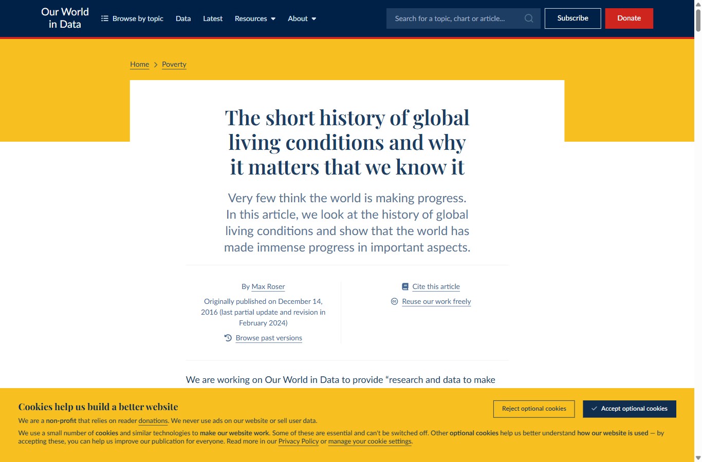
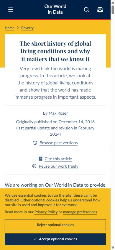
Open the source article and the page tells you what kind of document it is before you read a word. A calm navy body sits below a serif headline on a white card; a gold band frames it; and as you scroll, a chart appears, then prose, then another chart. The rhythm is almost metronomic. This page is a homage built in that same language, so the analysis and its subject look like one object.
Our World in Data is a data-explainer: a research commons where the charts are the evidence and the prose is connective tissue between them. Everything about the layout is engineered for one feeling, trust, and that feeling is manufactured with a small, disciplined kit: a Playfair serif headline, a Lato body set in navy rather than black, a navy-and-gold brand, heavy citation and reuse affordances, and a steady visual cadence of about one chart per screen.
The reading order
How it structures longform content
The spine is conventional and never reorders between breakpoints, which is itself a usability decision: a reader who has seen one explainer knows exactly where the next one keeps its parts. From the top edge down there is a navy header bar, a thin red rule, a gold banner, and a white content card that holds the centred headline and deck. The byline block comes next, and it does something most blogs never bother with.
Instead of a share row, the byline leads with citation. “By” an author, then “Cite this article,” “Reuse our work freely,” and “Browse past versions.” Before you read the argument, the page has already told you it is sourced, versioned, and free to reuse. That is the entire personality in one block: this is a commons, not a column.
Key insight
The headline is the only serif on the page. Everything else — body, headings, interface, chart labels — is Lato. One serif, used once, does all the ceremony; the sans does all the work.
Hierarchy without a shout
Contrast comes from typeface and colour, not from size explosions. The Playfair H1 is centred on a white card so it reads as a masthead. Section heads drop to a quiet 24px Lato in muted blue-grey, so they behave as pauses rather than billboards. Colour is rationed to a purpose: navy is the ink, gold frames and highlights, and a single red marks the brand rule and the “Donate” call. Because the red appears so rarely, it carries weight when it does.
Charts are paragraphs
The defining structural move is that charts are not illustrations dropped beside the text; they are steps in the argument, spaced down the page at a near-constant rate. Each one is an interactive figure with a title, a subtitle, a source line, and download and share controls. The prose exists to set up the next chart and read out the one above it. That is the cadence this study is really about.
Two renderings, one contract
Desktop vs mobile
Unlike publications that hold their type size on the phone, this one lets the body shrink and the measure narrow, trading a little legibility for fit. What it never trades is the contract of the page: the same navy ink, the same Playfair headline, the same citation-forward byline, and the same one-chart-per-screen rhythm survive intact on a 390px phone.
| Attribute | Desktop | Mobile (390) |
|---|---|---|
| Body | Lato 18px / 27.9px (1.55), navy #1D3D63 | 14px / 21px, navy |
| Measure | 628px column, ~70 characters per line | 295px, ~42 characters per line |
| Headline (H1) | Playfair 40px, weight 600, centred | Playfair ~20px, centred |
| Section head (H2) | Lato 24px, muted blue-grey | Lato ~20px, muted |
| Hero frame | White card floating on a gold banner | Card fills width; gold shows top and sides |
| Byline | Two columns: author · cite / reuse | Stacks to one column, same links |
| Visual cadence | 22 interactive charts across 82 paragraphs / ~20 screens ≈ 1 chart per screen | |
Read the last row across both columns: the layout adapts, but the cadence does not. Whatever the width, a chart is never more than about a screen away.
The point of this study
Visual cadence
Count the figures against the scroll and the pattern is unmistakable. The source runs 22 interactive charts across 82 paragraphs, and the page is about 20 screens tall, so charts land at roughly one per screen. They are not clumped into a gallery and they do not thin out after the intro; they are metered evenly, which is what keeps a long, statistics-heavy read from feeling like a wall of numbers. Every screen gives the eye a chart to rest on and the argument a piece of evidence to stand on.
a screen of prose a screen that carries a chart
To see the pacing as a single line, plot the running total of charts against how far you have scrolled. If charts were front-loaded the curve would leap early and flatten; if they trailed off it would sag. Instead it climbs a near-straight diagonal, hugging an even-pace reference the whole way down — the signature of deliberate, metered cadence.
Charts arrive at a steady cadence — about one per screen
Cumulative interactive charts encountered as the reader scrolls the explainer
The takeaway is not the exact count. It is that imagery here is a pacing instrument. Charts break the scroll into readable beats, each one a place to pause, absorb a fact, and push off into the next paragraph. Remove half of them and the prose would not get shorter — it would get harder.
Tokens and rules
The design system
Two families do all the work, and the split is strict. A serif carries ceremony; a humanist sans carries everything else. Setting the body in navy rather than black softens the page just enough to read as considered rather than clinical, while staying well above the contrast floor.
Type pairing and scale
- Headline (H1)Playfair Display — 40px, weight 600, centred, navy
- BodyLato — 18px / 1.55 (27.9px), weight 400, navy #1D3D63
- Section head (H2)Lato — 24px, muted blue-grey #577291
- DeckLato — ~1.28rem, centred, muted, weight 400
- Eyebrow / chipLato — 0.72rem, 700, uppercase, .16em tracking
Palette
Measure, leading and signature devices
- Measure628px column → ~70 characters per line, dead centre of the readable range
- Leading1.55 on an 18px body — comfortable for statistics-dense prose
- Hero frameWhite card floating on a gold banner beneath a navy bar + red rule
- BylineCitation-forward: cite, reuse, and version links before the read
- Chart cardTitled, sourced figure with a navy top rule; one per screen
- AccentRed rationed to the brand rule and the donate call; colour never the only signal
Portable ideas
What to steal
- Meter your imagery. One meaningful figure per screen turns a long read into readable beats. Space them evenly instead of front-loading a gallery.
- Lead the byline with citation. “Cite this” and “Reuse freely” before the first paragraph tells the reader the work is sourced and trustworthy without saying so.
- Set the body in navy, not black. A dark navy ink reads as considered and stays comfortably above 4.5:1 on white — softer than black, just as legible.
- Spend one serif, once. A single Playfair headline over an all-sans page buys ceremony without slowing the read.
- Frame the masthead. A white card floating on a colour band gives the title a stage and separates “who we are” from “what we are saying.”