Longform design study / No. 13
Stripe Engineering
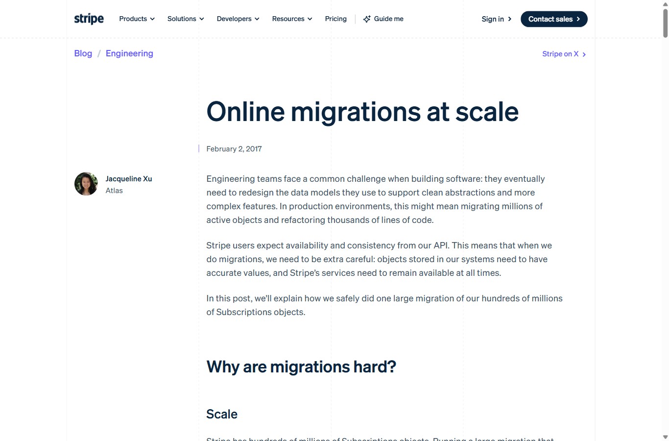
How a payments company makes deep systems writing feel effortless: light slate sans on white, navy headings, one blurple accent, a dashed margin grid, and a diagram roughly every screen and a third.
The reference is an engineering post about migrating hundreds of millions of live objects without downtime. It is dense, technical, and completely undramatic to look at — and that restraint is the whole trick. Nothing on the page competes with the argument. The type is quiet, the palette is nearly monochrome, and every diagram earns its place by explaining one concrete step.
This page is a homage. It is built in Stripe Engineering's own visual language so the analysis and the object of analysis read as the same artefact. Every colour, size and rule below is derived from the live post and rebuilt from a spec.
How it structures longform content
The page has a single, calm spine. A slim top nav with the wordmark and a navy call-to-action pill, a dashed hairline, a breadcrumb, then the essay itself set inside a dashed margin grid. There is no hero image, no gradient, no scroll theatrics. A reader who has opened one Stripe post knows exactly where the next one keeps its parts.
The reading order
From the top edge down the layout is deliberately conventional: nav, breadcrumb, an oversized navy headline, a date marked with a small blurple tick, a left rail carrying the author, then a long single column of slate prose punctuated by navy section heads, code blocks, and architecture diagrams. Convention is the point — attention is spent on the systems argument, not on decoding the page.
Hierarchy from weight and colour, not size alone
Hierarchy is built from tonal contrast. Body copy is a soft slate, never pure black, so headings in deep navy step forward without shouting. The single accent — a saturated blurple — is rationed to links, the date tick, and diagram arrows. Because it appears so rarely, it reads as a wayfinding signal rather than decoration.
The most Stripe-specific device is the dashed margin grid: faint vertical rules frame the column and a dashed hairline separates the nav. It is barely visible, yet it quietly signals engineering precision — a blueprint under the prose. Here is the whole effect in three declarations:
/* Stripe's signature: a dashed blueprint frame */
.shell {
  max-width: 1108px;
  border-left:  1px dashed rgba(10,37,64,.12);
  border-right: 1px dashed rgba(10,37,64,.12);
}
Desktop vs mobile
The responsive behaviour is almost entirely about the measure. On desktop the body sits at 18px over an ~810px column — around 90 characters per line, at the roomy end of readable. On a 390px phone the type steps down to 15px and the column narrows to ~343px, roughly 46 characters. The two-column frame collapses: the left author rail folds up into a compact byline above the article.
| Attribute | Desktop | Mobile (390) |
|---|---|---|
| Body | 18px / 28 (1.56), weight 300, slate #425466 | 15px / 24, same slate |
| Measure | ~810px column, ~90 characters per line | ~343px, ~46 characters per line |
| H1 | 32px, weight 700, navy #0A2540 | Wraps to 3 lines, same weight |
| H2 | 34px, weight 500 (larger than H1) | ~26px, weight 500 |
| Layout | Left author rail + article + dashed frame | Single column; rail folds to a byline |
| Links | Blurple #635BFF, underline on hover | |
Notice the quirk in that table: the H2 is actually larger than the H1 (34px vs 32px). Stripe leans on weight, not size, to rank them — the H1 is heavy at 700, section heads are lighter at 500 — so the page never feels front-loaded. What does not change across breakpoints is the contract: same face, same slate body colour, same blurple links.
Visual cadence
This is where the post is unusually disciplined. Across roughly 42 paragraphs and about 15 phone screens it places around 11 architecture diagrams — one every 1.3 screens. That regular beat is what keeps a dense migration story readable: the reader is never more than a scroll or two from a picture that resolves the paragraph they just fought through.
The diagrams themselves follow one repeated shape. Every time Stripe introduces a mechanism it runs the same four-beat loop — assert the idea in prose, show it as a diagram, prove it with a short code block, then return to prose to resolve. Below is that loop, drawn in the site's own palette: slate boxes, navy labels, blurple arrows.
Plot those eleven diagram beats against the scroll and the rhythm is obvious — an even pulse rather than a wall of text with a few pictures bolted on. The strip below maps where each diagram lands across the fifteen screens of the phone read.
This is the bridge worth stealing for audit reports and AI explainers: the same cadence loop turns a findings dump into a narrative — summary, a severity chart, a per-finding callout, then a diagram — repeated at a steady interval so the reader always has a visual anchor within reach.
The design system
One typeface does nearly all the work. Stripe ships its proprietary Söhne for body and headings; this homage substitutes Inter, which shares the same humanist-grotesque calm. Code is set in a monospace — here Source Code Pro. The personality is the pairing of one quiet sans with one code face, over a nearly monochrome palette lit by a single accent.
Type pairing and scale
- BodyInter (for Söhne) — 18px / 1.56, weight 300–400, slate #425466
- Headline (H1)Inter — ~32px, weight 700, navy #0A2540
- Section head (H2)Inter — ~34px, weight 500 (lighter, yet larger than H1)
- Sub-head (H3)Inter — ~18px, weight 600, navy
- CodeSource Code Pro — ~14px on a #F6F9FC panel, navy ink
Palette
Measure, leading and signature devices
- Measure~810px column → ~90 CPL on desktop, ~46 CPL on mobile
- Leading1.56 — airy for a technical read, not luxurious
- Margin gridFaint dashed vertical rules framing the column; dashed hairline under the nav
- Left railAuthor avatar + name + team; folds to a byline on mobile
- Accent useBlurple reserved for links, the date tick, and diagram arrows — nowhere else
- Diagrams~11 across the read; slate boxes, navy labels, blurple arrows, always captioned
What to steal
- Set body in slate, not black. A soft #425466 lets deep-navy headings step forward on their own. Pure black body flattens the hierarchy and tires the eye over a long technical read.
- Ration the accent to one job. A single blurple, used only for links, the date tick and diagram arrows, reads as a wayfinding signal. Spread the same colour across buttons and rules and it becomes noise.
- Rank by weight, not just size. Stripe's H2 is larger than its H1 but lighter, so the page never feels top-heavy. Let weight carry the hierarchy and sizes can stay close together.
- Give diagrams a steady beat. One picture every screen and a third turns a dense argument into a walkable one. Cadence matters more than polish — a plain boxes-and-arrows diagram on rhythm beats a beautiful one that arrives late.
- Frame the column with a whisper. The dashed margin grid is nearly invisible, yet it signals engineering precision and quietly holds the eye to the measure. Restraint is the brand.